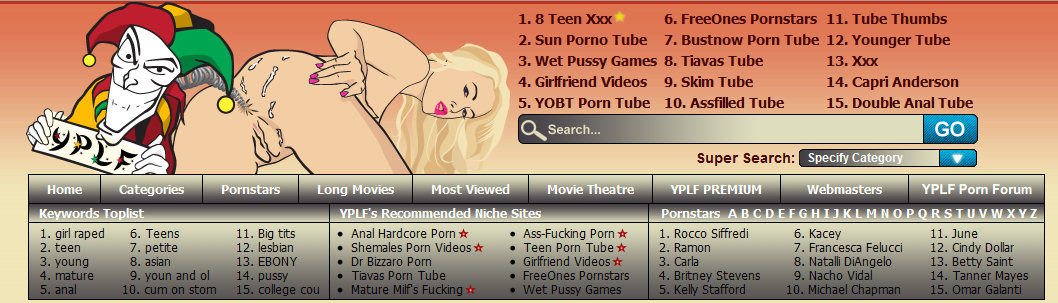
The logo is updated. Reversed, slightly bigger text font and the "dildo" is exchanged to a spring. I´m not totally happy with the spring, but I guess it will have to do. Took me almost one full day to create that spring in Illustrator... Anyway, perhaps is the logo somewhat better now at least?
http://www.yplf.com
Previous version of the logo
 New version of the logo